
Design
10×20 Booth Design Ideas That Actually Drive Traffic
March 2026 · 5 min read
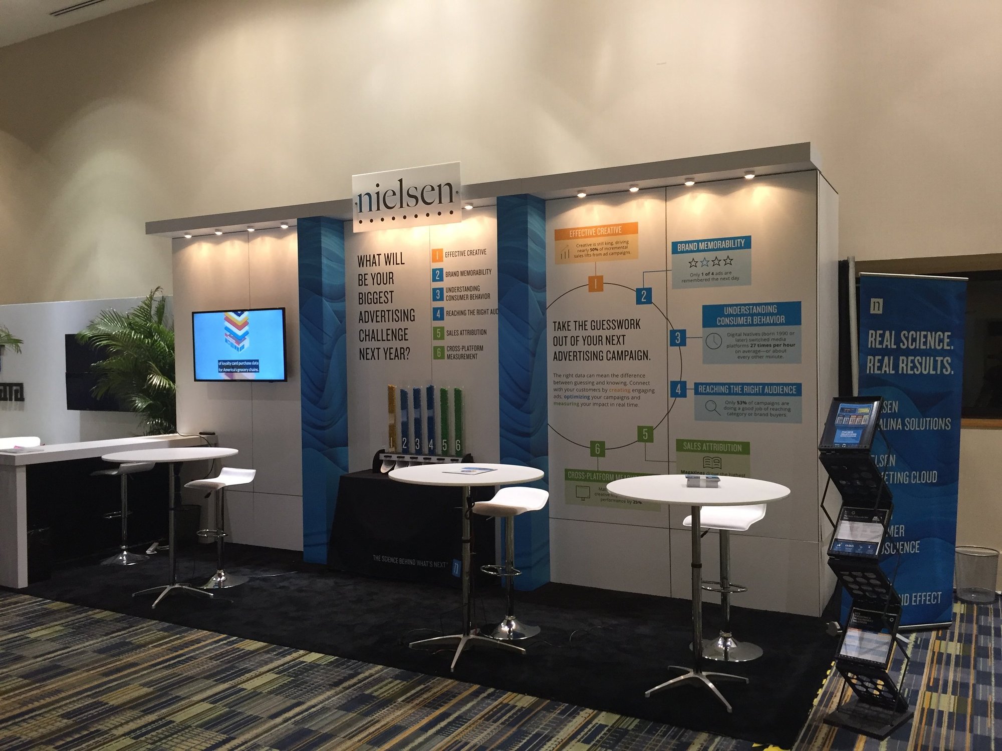
The 10×20 is the most competitive footprint on most floors. Layout, sightlines, and lighting decide whether people stop.
Open the aisle edge
The fastest way to kill a 10×20 is a counter parked across the front. Pull hospitality and greeting to one corner and leave the rest of the aisle frontage open so attendees can step in without committing.
A demo aisle running the depth of the booth gives staff somewhere to walk a prospect without blocking the entrance.
Build height, then light it
Most venues allow inline structures up to a set height at the back wall. Use it. A backlit tension-fabric header reads from three aisles away; a printed wall at eye level reads from ten feet.
Wash lighting on the graphic wall and edge-lit dimensional logos do more for visibility than adding more graphic content.
Give people a reason to stand still
A working demo, a product wall with pieces people can pick up, or a short scheduled presentation converts a walk-past into a conversation. Charging stations and seated meeting space keep qualified visitors on your carpet longer.
Plan storage into the structure. A booth with cases stacked behind a curtain looks unfinished by day two.
Placeholder editorial content — figures shown are intentionally fake.